According to Wikipedia, Lowbrow art or commonly known as Pop Surrealism- it describes an underground visual art movement that arose in the Los Angeles, California, area in the late 1970s. Lowbrow is a widespread populist art movement with origins in the underground comix world, punk music, hot-rod street culture, and other subcultures. Lowbrow art often has a sense of humor - sometimes the humor is gleeful, sometimes impish, and sometimes it is a sarcastic comment.
Lowbrow-the-Movement has here been assigned a "circa" of 1994, as that is the year that Lowbrow artist extraordinaire Robert Williams founded Juxtapoz magazine. Juxtapoz showcases Lowbrow artists and is currently the second best-selling art magazine in the U.S. (This seems like a good time to mention, too, that Williams claims copyright on the word "Lowbrow." As both pioneer and current grandee of the movement, he is certainly entitled.)
The roots of Lowbrow, however, go back decades to Southern California hotrods ("Kustom Kars") and surf culture. Ed ("Big Daddy") Roth is frequently credited with getting Lowbrow, as a movement, underway by creating Rat Fink in the late 1950s. During the 60's, Lowbrow (not known as such, then) branched out into underground Comix - particularly Zap and the work of R. Crumb, Victor Moscoso, S. Clay Wilson and the aforementioned Williams.
Over the years, Lowbrow has unapologetically picked up influences from classic cartoons, 60's TV sitcoms, psychedelic (and any other type of) rock music, pulp art, soft porn, comic books, sci-fi, "B" (or lower) horror movies, Japanese anime and black velvet Elvis, among many other "subcultural" offerings.
YOSUKE UENO
Among one of the artist in this art movements is Yosuke Ueno. This Japanese artist was born in Japan in 1977. He has been building his world since a young child and had his first solo show in Yamaguchi, Japan in 1994 at the young age of 16..has a very cosmic feel to it- the colourful colours and the dreamy feel to his artworks. Besides the usage of colourful range of colours, his themes are filled with bizarre, sureal and provoking images. Most of his mystical creatures are influenced by the japanese's folklore magical creatures and gods, and Buddhism.
Weird, creepy but in a beautiful kind of way, Ueno's art stands out for its interesting juxtapositions and hidden symbolism. Skulls, swans, scissors and even AOL characters appear in his paintings, making you wonder what kind of hidden message they all carry. Ueno's work has shown with some of the most established galleries including major exhibitions in his home country of Japan at the Shimoni-Seki Museum and Museum of Contemporary Art Tokyo
 |
| Positive-E no. 4 |
 |
| Electric Civilization |
 |
| Efil |
 |
| Efil |
 |
| Forestia |
Forestia is among one of the paintings that's Themed with "Efil". The whole painting itself may be seen as "an-out-of-this-world" creature with a human. However, Efil has it's own meaning to it and as it was stated in Ueno's blog, Efil is the symbol of life.
With Ueno's concept of Buddhism and his beliefs opposing to violence, he uses his works as his form of language to convey Peace. This is also why his art exudes love, positive energy, and space.
Elements of Design
Lines – The artist uses fuzzy lines to show movements of the lines in the background. It gives a movement impression towards the subject.
Shape- The shape of the main subjects are clear and vivid to be the main focus of the painting. The shape of the clouds are blurred to show depth and different grounds and some elements has a blurry shape to give an impression of it’s small particles.
Value – the values in the art work can be seen through colours –from multiple colours to one colour. It is to attract the eyes on the main subjects (girl and Elif). Values can also be seen by the size – smaller elements were drawn around the main subjects to as it is to focus on the object.
Colours – A wide range variety of colours are being used and creating harmony and contrast.
Efil's form is very highly influenced with Buddhism, where the most prominent colour concept in Buddhism is that of the rainbow body, which is the highest level of meditative achievement wherein the body is transformed into pure light. It is the highest achievement other than Nirvana, which is the essential end-goal for Buddhists. Since the "pure light" on the spectrum contains all colors, and is white, to possess a rainbow body means to possess all colors, and to do some means meditating on colors that embody specific teachings.
Orange on the other hand symbolizes as Wisdom and it's attached close to the colour black. Like every other cultures, black symbolizes a bad thing but instead it is used as a reminder of conquest by not annihilating, but turning evil into good - by understanding and learning rather than settling on ignorance as it is the path to clarify and truth.
By pairing up Ignorance and Wisdom- it is a balanced element between the both in order to achieve a better approach on Efil (life).
Texture - Smooth texture. (acrylic on canvass)
Alignment – centre alignment- all main subjects are in the middle and creating fair balance throughout the other areas of the painting.
Proportion – The proportion is balanced, however it is not in a natural scale as there’s a huge face on the bottom of the painting and the human has a large head than the average human has – this is to emphasis that this is the “Forestia”-which uses the concept of ancient paintings where the gods are drawn bigger to show its status.
Eye movement – There are a lot of eye movement as there are a lot of principle design in contrast and repetition. It causes the eyes to move throughout the paintings.
Principles of Design
Hierarchy- It first focuses on the face of Forestia – the main subject before moving up to the two subjects above before the colourful elements caught in the eye movement.
Balance – The balance of size and colour –Huge, big, medium to small and smallest. The balance usage of colours as the colourful elements are balanced with the white areas.
Proximity- The repeated colourful elements grouped together creates the floor / water of the forest and the two trees give a sense of connection that the two main subjects are sitting on a bridge.
Rhythm/repetition – a lot of repetition are used to create eye movement on the painting and at the same time to create volumes, depth and etc. It also creates a forest setting.
Scale - The scale is not based on a normal human size – huge head to a small body.
Unity/ Variety- There are a unity in terms of colours – colourful elements creates a unity within the picture and the variety can be seen through the different shapes and sizes of each subjects.
Harmony: The painting has a wide set variety of colours and the repetition of the small elements / subjects of the painting.
JUNKO MIZUNO
Another Artist that I am interested with the art is Junko Mizuno. She is a Japanese Manga (comic) artist turned contemporary artist which dives into the world of Lowbrow Art. Mizuno's style is a mix of childish with blood and terror which in japanese term - kawaii noir. Besides her comics, she designs calendars, t-shirts, postcards and her designs were also used in the documentary series Japanorama which were aired on BBC.
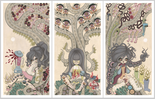 |
| Waiting Series |
The waiting series depicted three different characters with three different disabilities. It perceived human's want regardless of their abilities which they couldn't achieve or make put use to. It is a very straight forward piece but with some hidden elements in it. Influenced with her cultural believes and folklore story, Mizuno made use of these elements to portray messages with each of her works.

In the waiting series, Mizuno uses the term - Like a moth to a fire. Representing the girls / female characters as a moth and parts of their bodies burning to reach for their desires/ wants.
It is referred to the Japanese's culture which the society will go over the edge to achieve bodily / physical wants in order to feel belonging and in par with the others.
The first is the character with cast on her hands,with a blender on her lap, and limbs hanging on the tree above her along with pomegranates. In Mizuno's culture and religion, Pomegranates is one of the three blessed fruits in Buddhism which symbolizes either fertility, hope and desire(Wikipedia). Because it's related to fertility the blood and the pomegranate paired together can be symbolizes as an unborn child.
Other than pomegranates, mushrooms too were used which are among the Eight Auspicious symbols of Buddhism. The dictionary defines a parasol as an umbrella used for protection from the sun - as the word 'parasol,' meaning 'to hold off the sun,' and 'umbrella,' meaning 'little shade,' were similarly impled. The Sanskrit term 'chattra,' also means 'mushroom,' in an obvious reference to its shape with the Parasol.
Next are the Fern leaves which sticks out from the root of the tree, which had the mushrooms lay hidden in the darkness of it's roots. Like the mushroom, Fern leaves symbolizes protection, luck, richness and external youth. Pairing it up with the mushroom, we can roughly translate it as a very strong protection.
The Fig tree symbolize enlightenment for Buddhism. A symbol of rebirth, peace and love. It also symbolizes wisdom as there are Fig trees or better known as The Boddhi Tree - a sacred tree.

The second panel shows another character without eyes while she's holding a book (knowledge) with red fires upon the pages. In the five elements of philosophy in Japan, the fire represents drive and passion in mental and emotional realms. Sometimes it can be associated with intentions. (Wikipedia) However, the colour red can come in alot of different terms, given that each shades of red has different meaning to it as Japanese's language has a liking in using word play to convey a message to the others.
The owls in the Japanese culture symbolize luck & protects one from suffering. The reason can be found in the Japanese name for owl Fukuro フクロウ (梟)which can be written in different sets of characters. One with the meaning of Luck (福 fuku, luck; 来ku, to come ;郎 ro suffix used in boys' names) and the other as protection from hardship (不 fu, no, 苦労 kurou suffering/hardship). With this play on words owls have been given different attributions and have become popular as engimono (縁起物) Japanese for lucky charms. Some people believe that different colours and owl shapes have influence on the type of power and luck.
Depending on species, owls are seen as messenger of gods while Bar or Horned owls are perceived as demonic figures. (http://www.animalspeek.blogspot.com/2006/10/owls-superstitions.html)

In the last panel is a third female character with casts on her legs while she made socks out of yarn balls. Residing on the same tree but this time the tree has legs and feet and five snakes with braides on their heads.
Since ancient times, snakes is considered as a bad omen except for white snakes which means wealth. Poison can be associated with snakes as well in terms of communications. Words (the snake's tongue) can be either poison or cure- because a snake's poison can be used to kill or to cure. The black snakes in the art can be referred to the evil voices of society "hissing" towards the girl to chase after her wants instead of needs.
To put it simply, the painting is able to be look in two sides of the coin - as a positive message or negative message.
Elements of Design
Lines – The artist uses thick lines to show volumes or the sturdyness of a subject in the painting. For instance, the tree. The lines surrounding it is thick to show it is a strong tree while the hair has partition to show the volume of the hair – the thickness of it.
Shapes – The shapes are simple geometry- not too complicated. The shapes are clear and easy to identified what it resembles to in real life.
Value – Dark to light. The hair colour black is the starting point of the focus has a very thick volume which attracts the eyes and it slowly moves towards the less darker areas. The usage of pale colours managed to made the hair colour to pop out and focus onto the main subject(s)
Colours – From the warm colours of red to cool colours of blue is used to create a balance and a harmony feel to it. However, the colour green is in a monochromatic to create a sense of unity with the ground and tree. Most of the colours that were use are very pale / light to give a moody / dead-like impression.
Texture - Smooth texture. (acrylic on canvass)
Alignment – horizontal but to each is vertically aligned.
Proportion – Successful in depicting three girls reading under a tree. Despite the non-human scale bodies and hair, there are balance to each and every of the elements.
Eye movement – There are a lot of eye movement as there are a lot of principle design in repetition. It causes the eyes to move throughout the paintings.
Principles of Design
Hierarchy- It first focuses on the girls as they are the main interests of an on looker. The secondary interests will be the repeated elements that’s within the painting.
Balance – The key balance is the area which are empty towards the areas that are filled with subjects.
The right and left painting, the “moon” serves as a balance as it has no repetition compared towards the other subjects. While the middle is based on the density of the areas. The subject above the tree is not as packed or dense with the ones below the tree.
Proximity- The elements on the roots are grouped together are giving the illusion to be seen as ground while the simplified leaves are group together to give an impression that it is a tree instead of an animal-snake, octopus.
Rhythm/repetition – a lot of repetition are used to create eye movement on the painting and at the same time to create volumes, depth and etc.
Scale - The proportion are not balanced as the humans are with huge hair and different sizes of limbs however, it is proportion to how a tree should be bigger than a human body. It still manages to depict that the girls are sitting under a treeUnity/variety
Unity/ Variety- There are a unity in terms of colours – almost all three paintings are majored by the colour green, brown and black. Unity in certain shapes and subjects – the trees, mushrooms, fern leaves but a variety on the different pattern of repetition.
Harmony: The painting uses colours that blends in without causing any huge conflict despite the contrast each colours has. The usage of complimentary colours also creates harmony..
No comments:
Post a Comment